A quick glance should never make you think
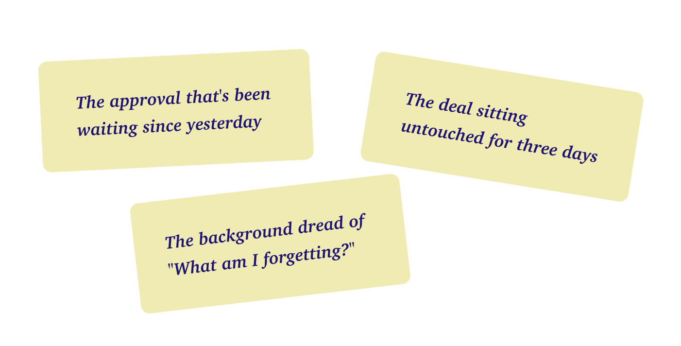
Imagine you're on the freeway trying to change lanes. You glance at your mirror and it shows the graph of each car - its speed, distance, etc. Something that you’ve to read, when you just wanted to know. Now, imagine you are the CEO of a chemical distribution company. Your team receives this email from the buyer's AI agent and it takes them three full days to respond. You would instantly feel the panic.
Hi,
The same thing is quietly happening across AI tools. As the agent gets smarter, the instinct is to show more of what it's doing until the screen that was once a glance becomes something you have to read.
Instinct
This case study shows what happened when a workflow redesign exposed every single step the AI agent took. It hurt customer decision-making, dragged out quote response times, and made the users extremely frustrated.
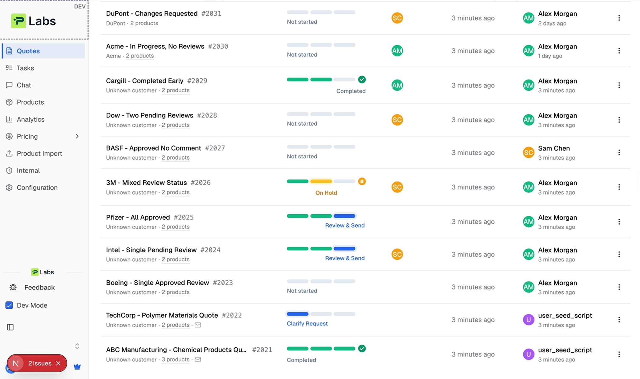
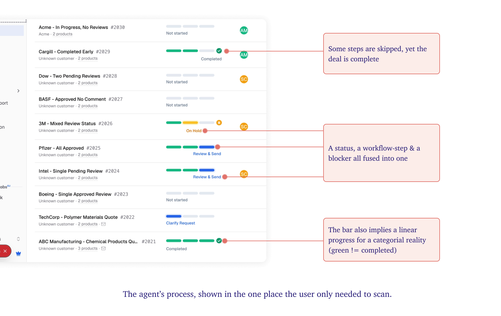
In their old design, the AI agent kept things simple by showing just one status per quote - In Progress, On Hold, or Completed. But in the new update, to show everything the agent was doing behind the scenes, they replaced that simple status with a live progress bar that tracked every single internal step.
Then the complaints from their users started :
“We just find that this contains a lot more information than we need"
It's very different for every quote. Flipping between Clarify request, match product & pricing”
Like this is completed, but it's adding this 4 bars. Like what do these 4 bars really mean?
“I've seen one that was like fully green, but it like wasn't marked as completed.”
HOW I TACKLED THE PROBLEM
Step#1: Understand the User Context
First, I needed to understand what Job their users were were hiring it for.
The primary user is the inside sales rep. They spend most of their day scanning this list, sending agent output for review, and answering questions when the agent is missing details. They do not open this list to admire a workflow. They open it with a violently simple job:
Across everything in flight, which of these needs me right now?
Underneath that job, I also found deeper emotional needs.
So comparing the actual user complaints against user’s JTBD made it clear.
The status redesign was useful, but it slowed reps down.
Step#2: Mapping the User Mental Model around the status column
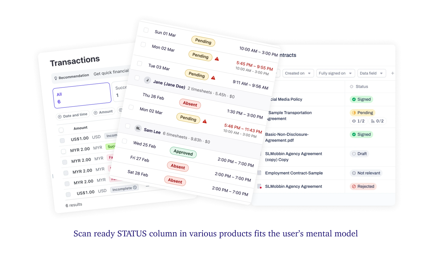
In the user’s mind, a status column sticks like a small, fixed list of predictable words: In Progress, On Hold, or Done.
Its real value is the consistent tiny vocabulary, that lets the rep instantly scan straight down a list and pause only when something need their attention.
Then I observed the tool’s redesigned screen violated every one of those expectations by abandoning the shared vocabulary. No two rows spoke the same language anymore. Some reported a big-picture state, while others showed a tiny internal workflow step. The list was no longer easy to compare and turned into a wall of random stories.
Step#3 : Exploring shape of the solution
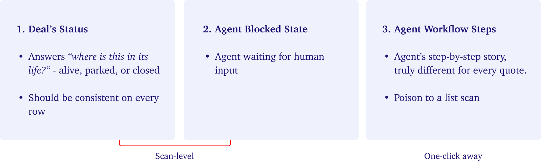
With the JTBD and user's mental models both broken, it was clear that the team had forced 3 completely different types of information into a single status column.
Hence, the fix was less about redesigning the screen and more about sorting information with two clear rules.
1. The lists scan surface should show the kind of thing it is.
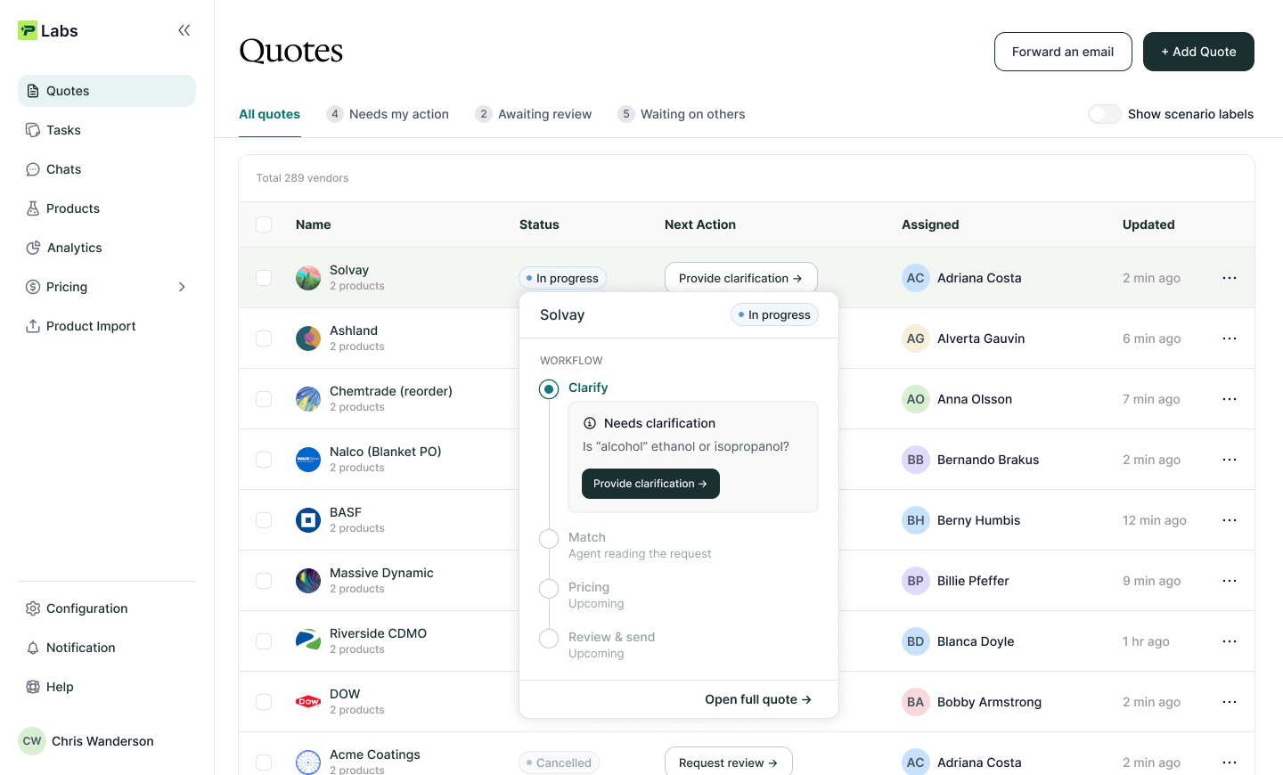
2. The details should be one click away and show what it is.
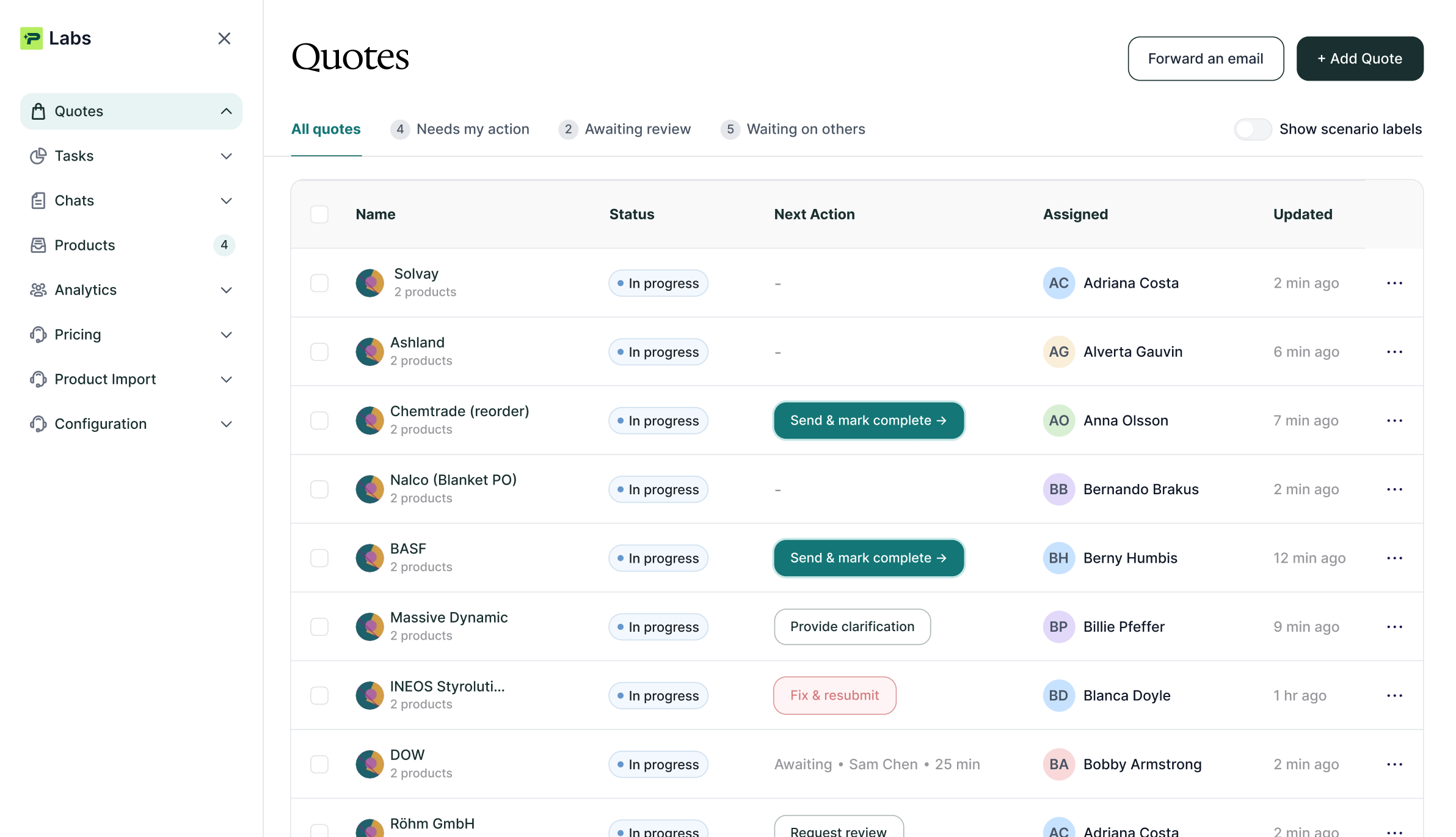
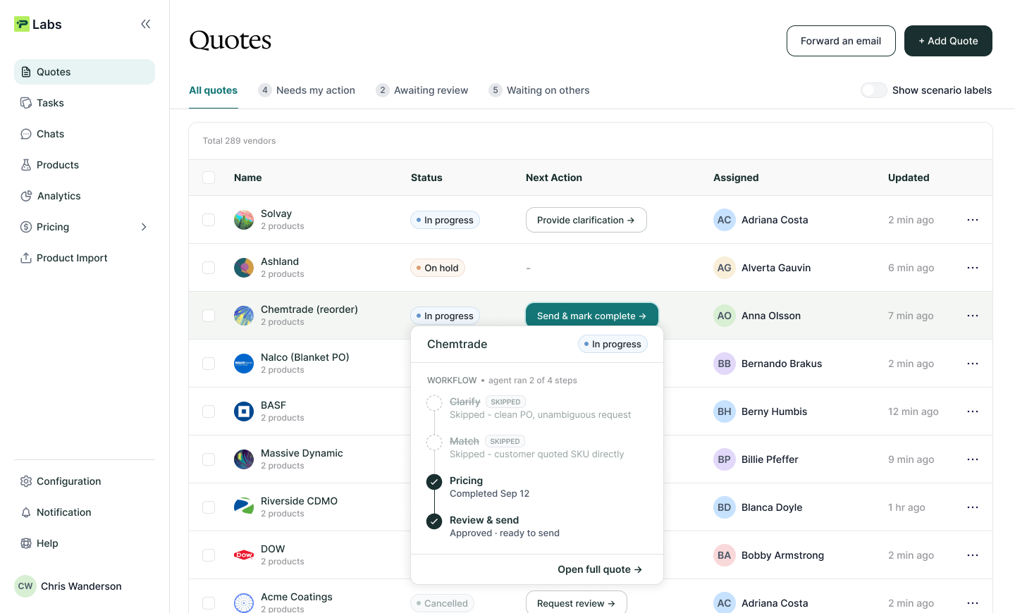
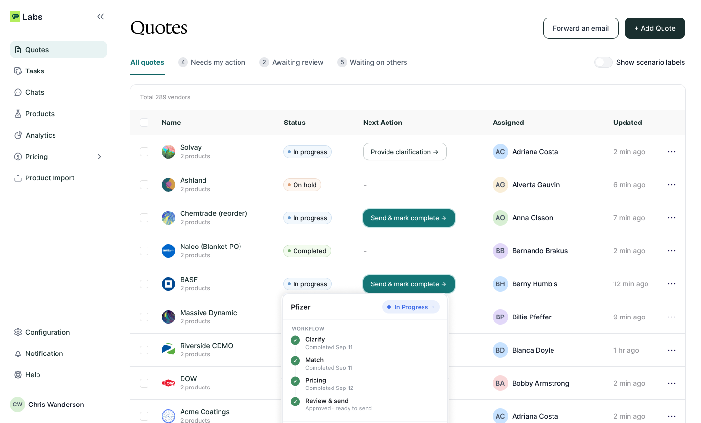
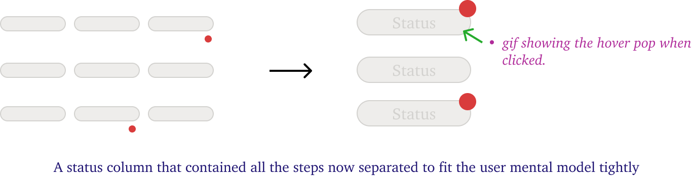
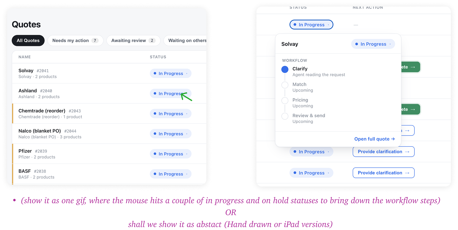
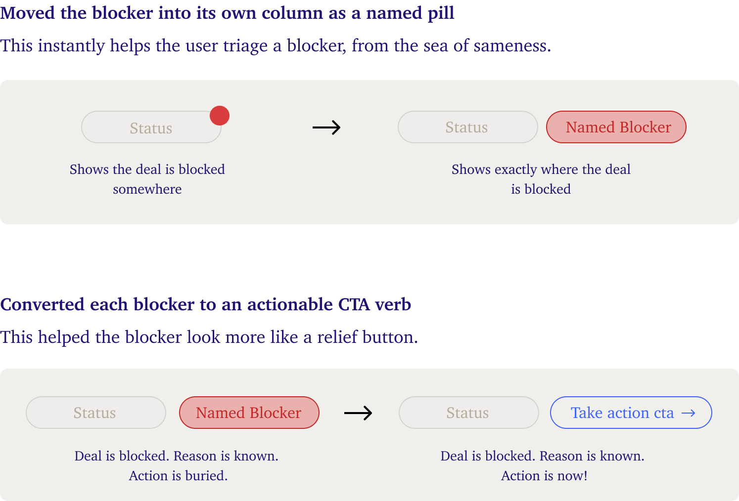
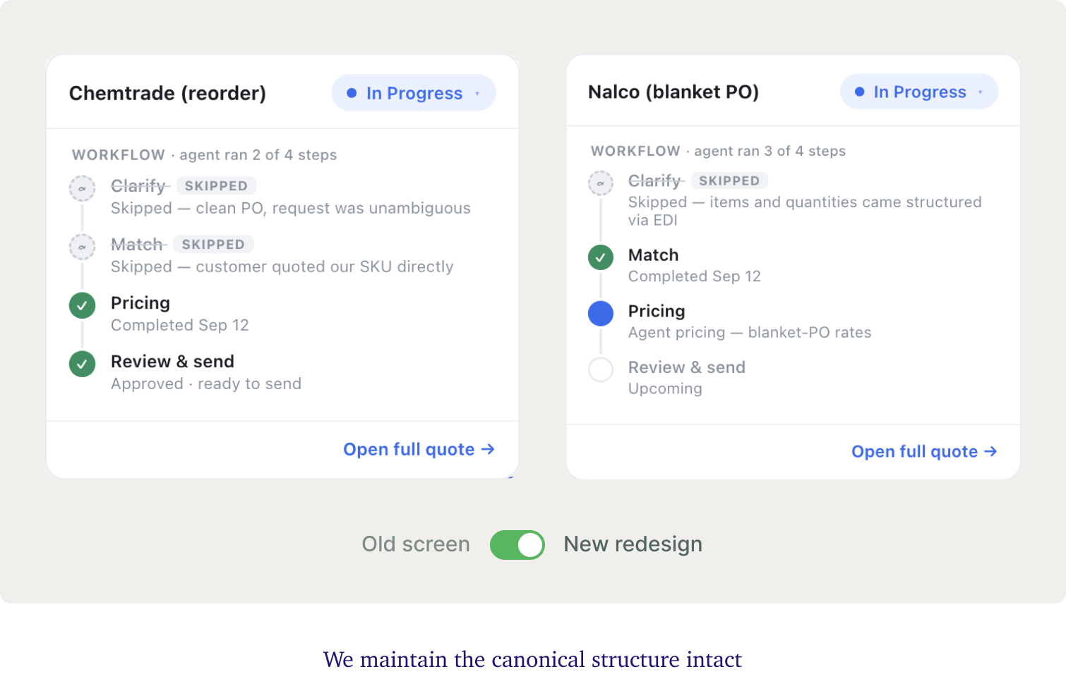
Hence, I moved the workflow steps inside a click & protected the scan surface.
Scan ready information remains up-top (status + blocker). Detailed information (agent workflow steps) goes inside. Everything else followed from that one separation.
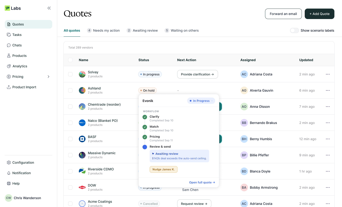
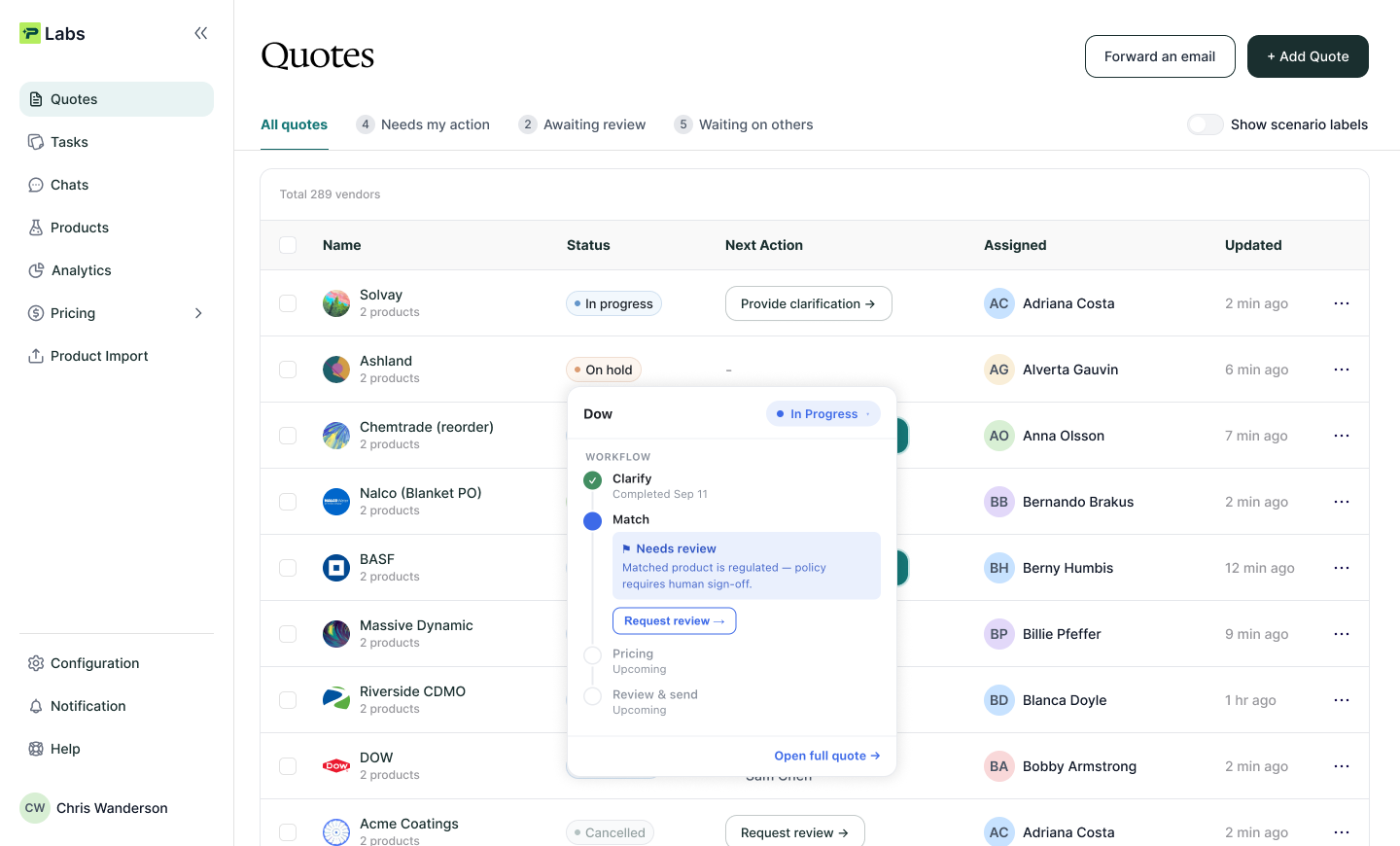
I also noticed that helping a quote move out of a blocked state is the most valuable action taken by the user to move a deal forward. So I made a couple more adjustments in the design
Bringing all design decisions together
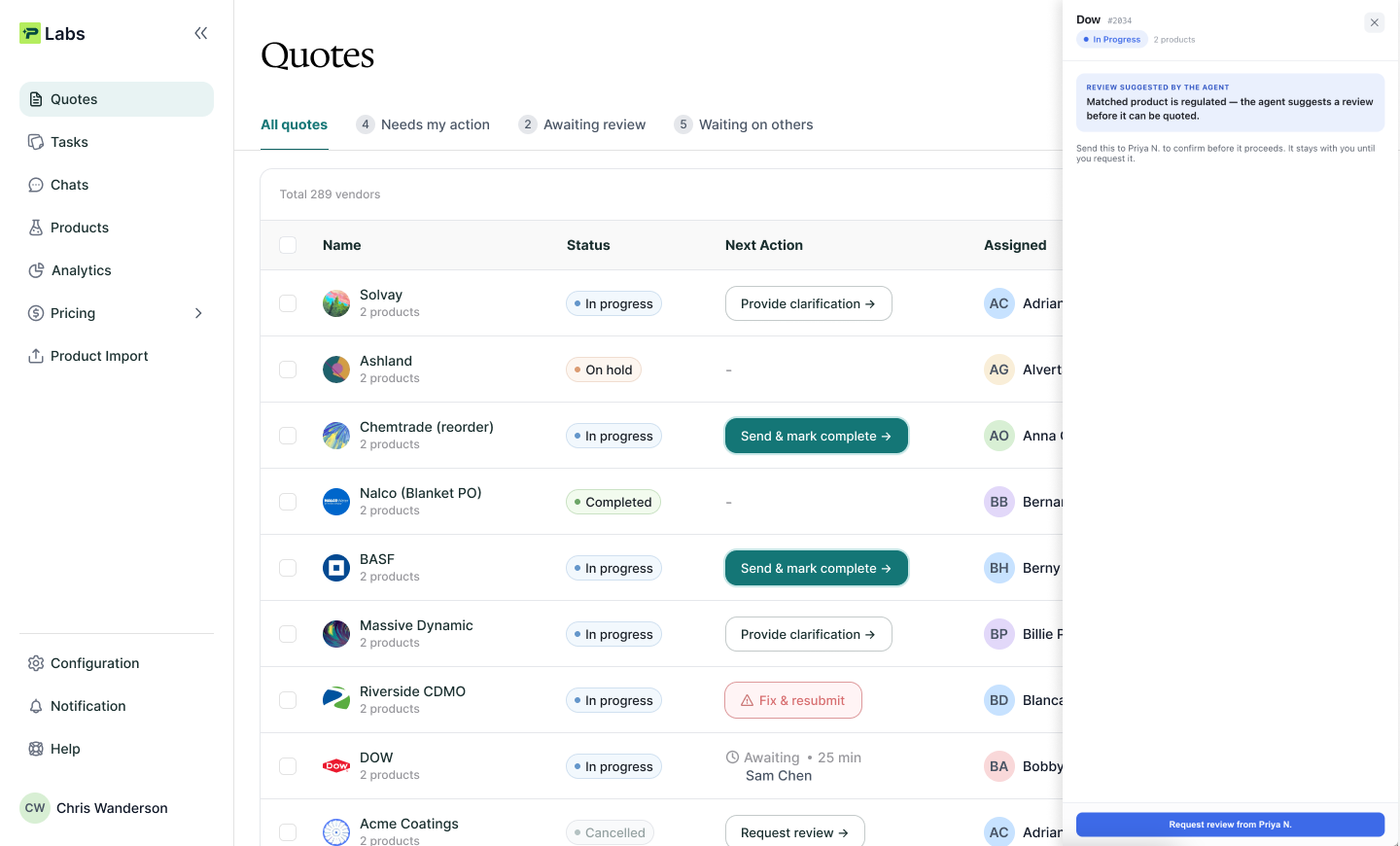
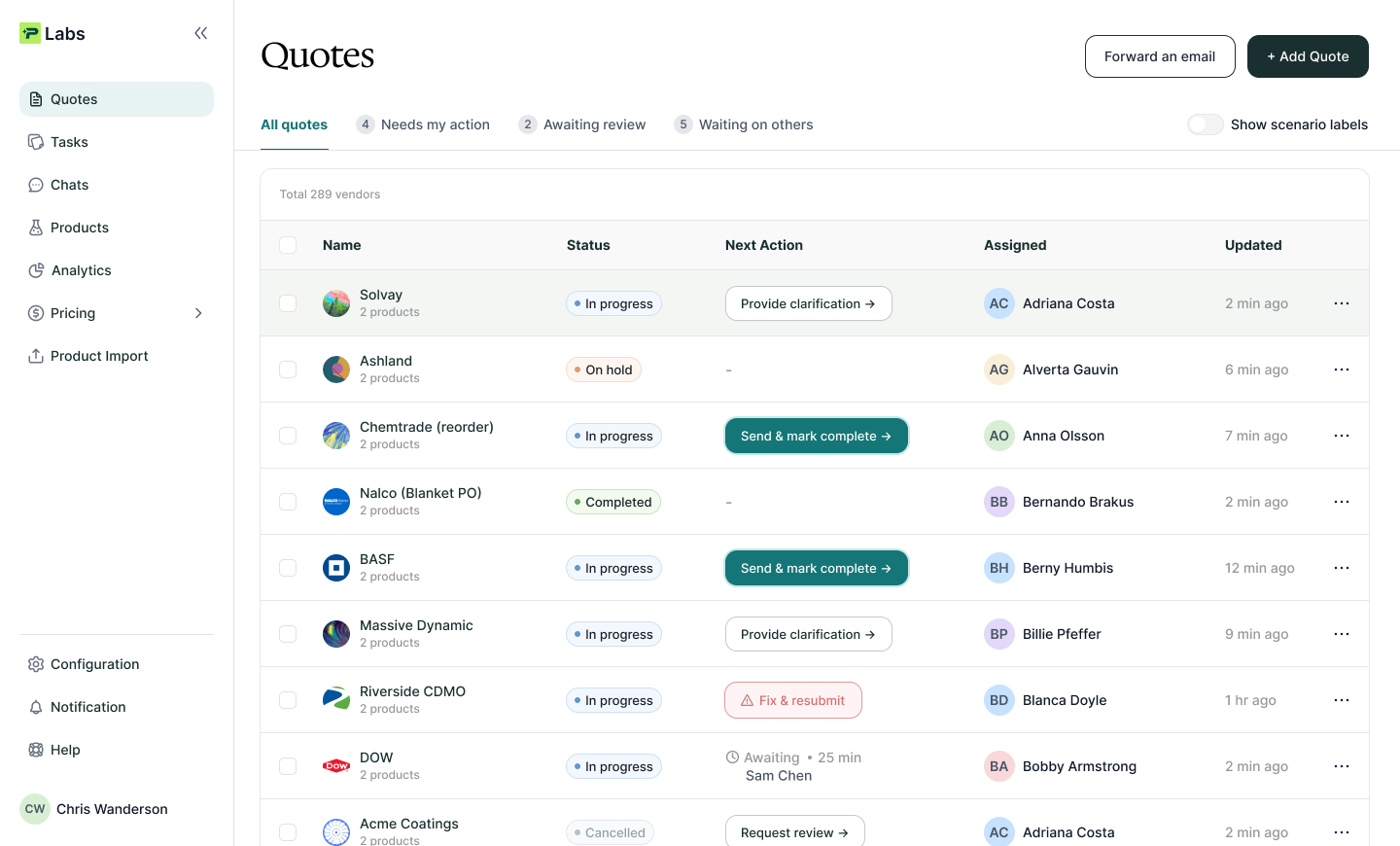
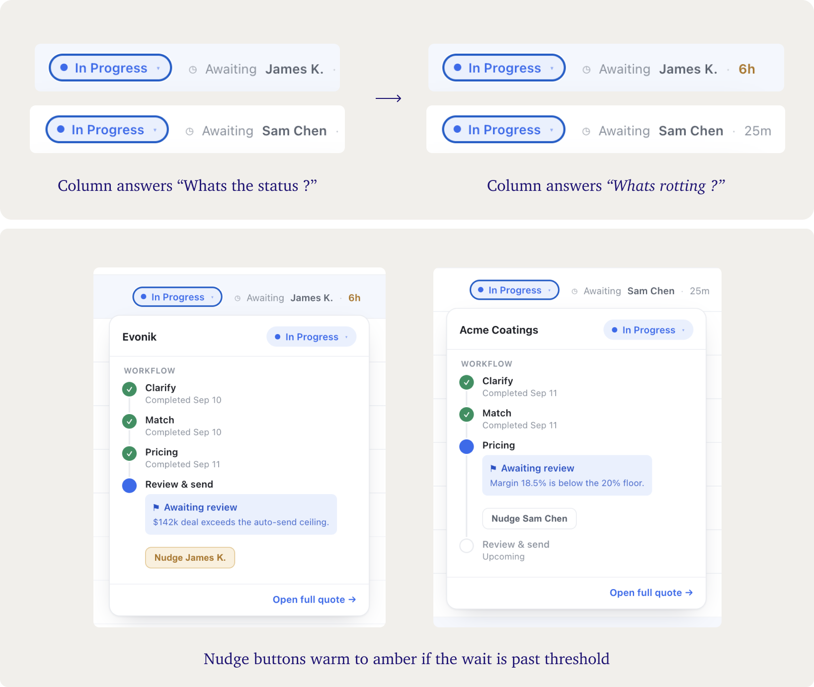
The end result is an interface that feels almost obvious. It helps the user easily answer the question "What needs me?" and leaves them feeling like their daily work actually got easier. Any blocked or in-progress quote now features a clear action button, making it simple to move deals closer to completion.
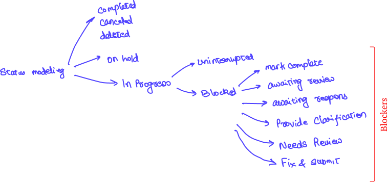
Of course, we mapped out all the statuses a quote goes through during its lifecycle. This exercise revealed six total blockers. We grouped and color-coded them by urgency, making it effortless for the user to triage their list.
DESIGNING THE HAND-OFFS
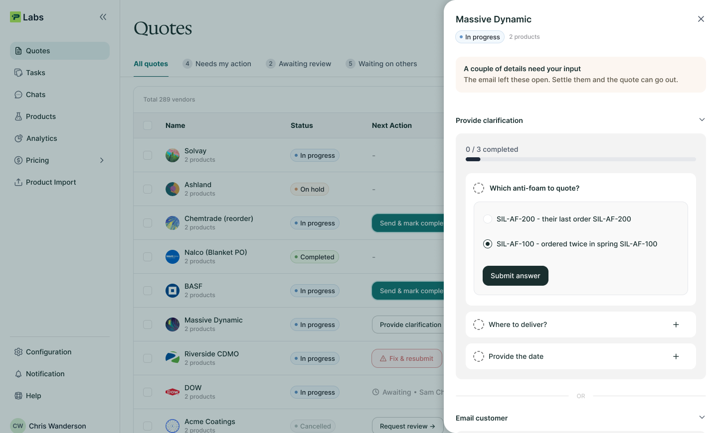
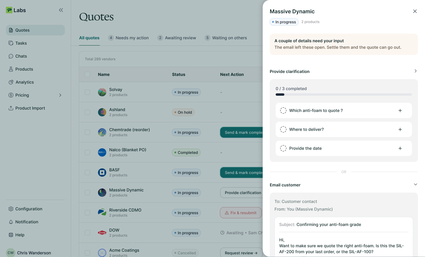
In an agent product, the interesting design is at the hand-offs
Beyond designing the separation above, I observed many opportunities for an optimized agent-human hand-off experience. I've illustrated them in the points below. And in between any design decision the tie breaker came from understanding the core question:
"What is the person actually trying to do?"
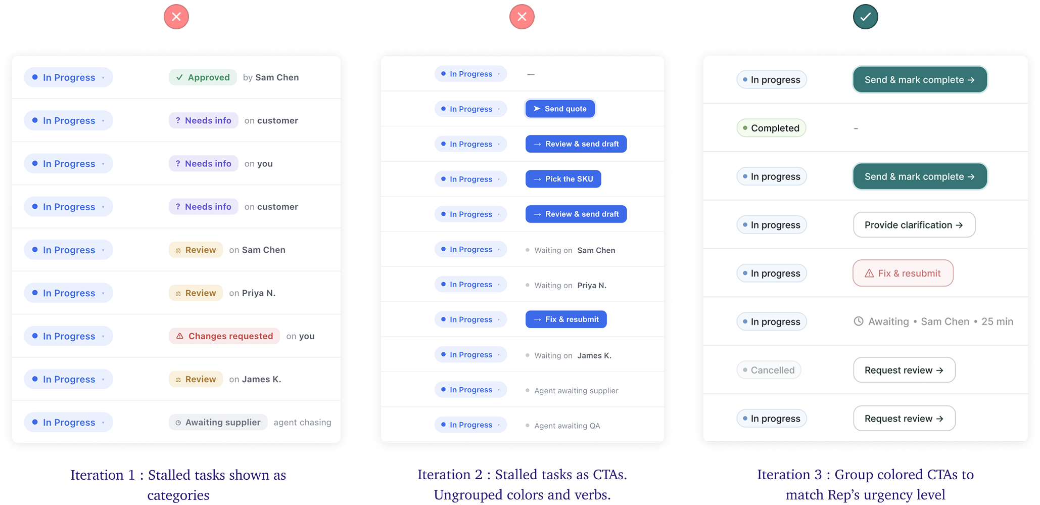
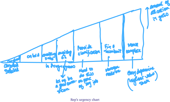
To arrive at the grouping of the blockers: I mapped it to the rep’s mental models in the order of urgency
- Solid Green → Highest value task. All steps are completed and the deal is one click away to be sent.
- Red → Need a fix on rep’s end (also the user’s reputation belongs here)
- Muted Gray - Rep is waiting on other’s, task doesn’t need their attention